BMW’s logo redesign gambit
BMW just updated their logo. They took out the gradients and beveling they added in 1997 that made it look 3D. (It was the ‘90s, after all.)
But they also took out the background. And the black ring. So now it’s a flat, semi-transparent favicon — you know, those tiny logo bugs in your browser tabs.
BMW says their new logo "radiates openness and clarity.” But it doesn’t radiate at all in most contexts. It blends in. It washes out.
A logo’s first job is letting you know you got the right brand. It should be findable. Instantly recognizable. Hard to confuse. This is vital because people confuse brands all the time, for both the ads and the products.
Its second job — conveying meaning or evoking thoughts — shouldn’t come at the expense of job one. And if the logo doesn’t have tons of intrinsic meaning (like Jaguar’s jaguar), it accrues it over time through everything else the company does. It’s an empty vessel that fills up with shared values.
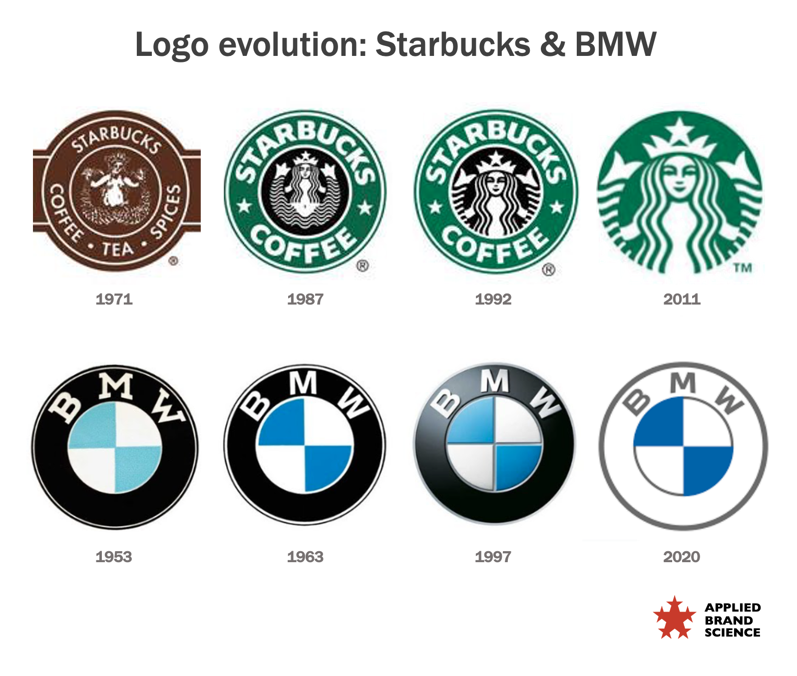
Starbucks’ logo evolution made it bolder and simpler and more recognizable. In comparison, BMW’s looks like a softening.
Yes it's more modern. Yes it gets rid of all the 3D effects of the 1997 logo. Yes it'll load faster on mobile, FWIW.
But it's risky to mess with iconic assets.