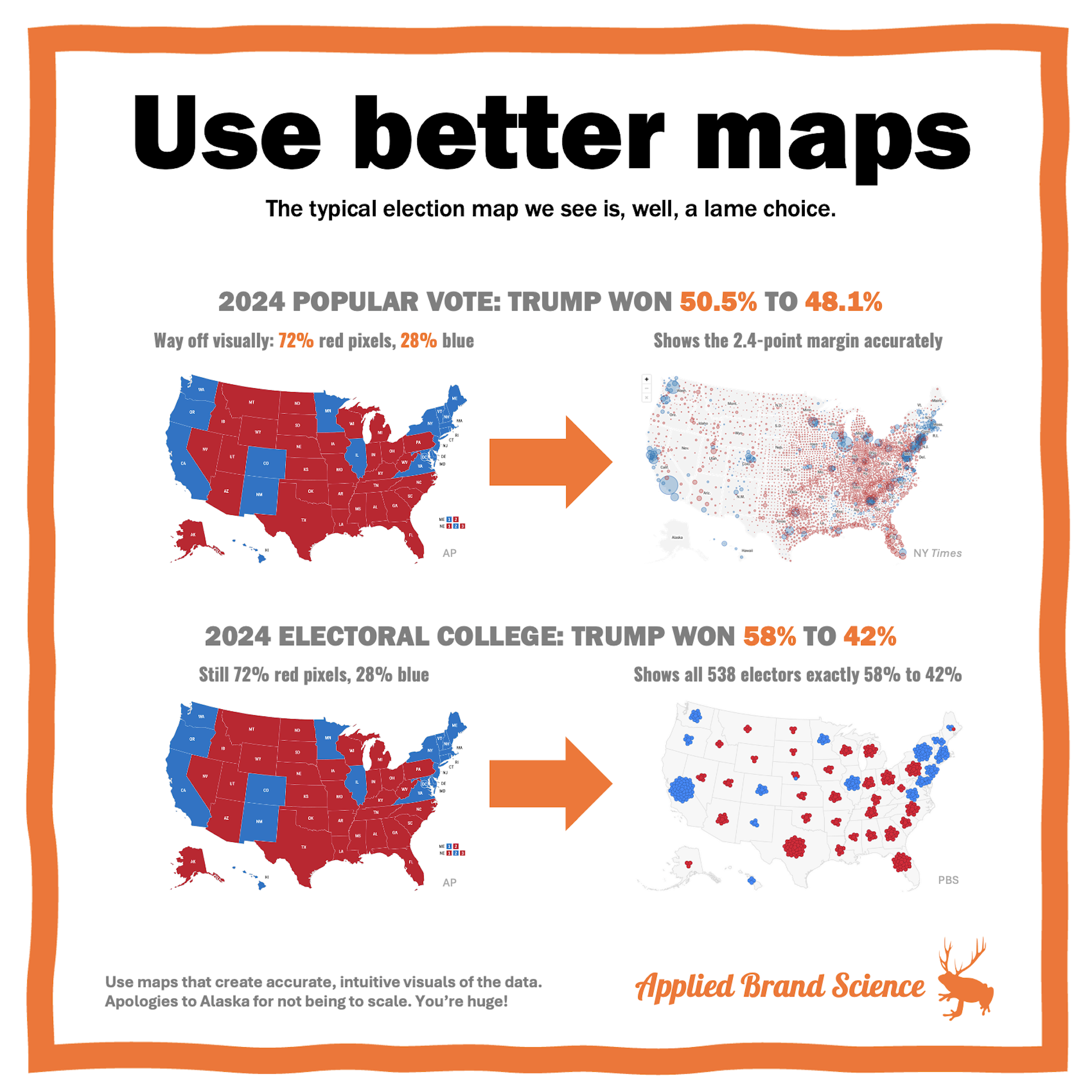
Which election map should we be using?
Like, which one is best at visualizing the actual numbers?
A couple weeks ago (Oct 30), I shared some election maps from 2016. The post was NOT about the candidates or the merits of the Electoral College. Nor is this one. It’s about MAPS.
The election map is a great, familiar example of how dataviz can color our view of the world. And that matters in business too.
So this week we have some fresh data:
➡︎ The popular vote was 50.5% Trump, 48.1% Harris (74.9MM to 71.4MM).
➡︎ The Electoral College vote was 58% Trump & 42% Harris (312 to 226).
But which MAP should we use to show these results?
🇺🇸 The TYPICAL election map — a state-filling red/blue “choropleth” — is just plain bad at showing EITHER of these results. Why? It’s not the states: it’s the pixel count.
The choropleth is 72% red pixels, 28% blue. So it’s VISUALLY 72/28. It way over-displays rural voters (per pixel) and way under-displays urban ones. I mean, Dallas alone has more people than Montana, Wyoming, North & South Dakota, Idaho, and Nebraska combined. And 72/28 doesn’t match EITHER of the results above.
🇺🇸 A better POPULAR VOTE map is a county-level “bubble map”, like this one from @NYTimes. It gives a great, instant, visual read of the 50.5 / 48.1 split in popular votes. And gives you a nice feel for where those votes are too.
🇺🇸A better ELECTORAL COLLEGE map is one like this beaut from @PBS, which puts a gumdrop for each elector on the map. It, too, gives a quick, visual read of the 58/42 Electoral College result. And it precisely shows all 538 electors.
So.
Why go through this seemingly-basic stuff in such detail?
Because if we chase the wrong data in business, that can be dangerous. And if we do so simply because we didn’t display it well, that’s just crazy.
If bad data takes you confidently in the wrong direction, then bad data visualization lets you jump confidently to the wrong conclusions.
SOME LESSONS:
🍊 If you use business dashboards, be careful with their default choices & settings.
🍊 If you use attribution models from big platforms (Meta, Google, etc.) be very cautious about what data they show & how they show it. They’ve a vested interest in the story they’re telling.
🍊 When you or your team present data, build charts & graphs that give you quick, accurate, & intuitive reads of the info.

