Want an ‘ownable’ logo?
Like, do you want your logo to never be confused with your competition?
Turns out there’s an interesting thing you can learn from some of the best in the world.
See, the first instinct for many logo designs is to do something “relevant” to the category.
- Coffee brand? Use a bean, or a steaming mug. And make it brown or tan.
- Financial planner? Include a money symbol. And make it stiffly blue.
- Milk? A cow. Natch.
The problem with this is that a coffee bean is generic to the whole category. And there are probably a few hundred coffee brands that are brown. And beany.
Want to know the conventions of your category? Just do an image search on [category] [logos] or “logos of [category] brands.” Then cross all those things out.
Because the first challenges you have as a brand are to
a) get people to notice you at all
b) be sure they can tell you apart from other brands, and
c) remember which brand you are — at all.
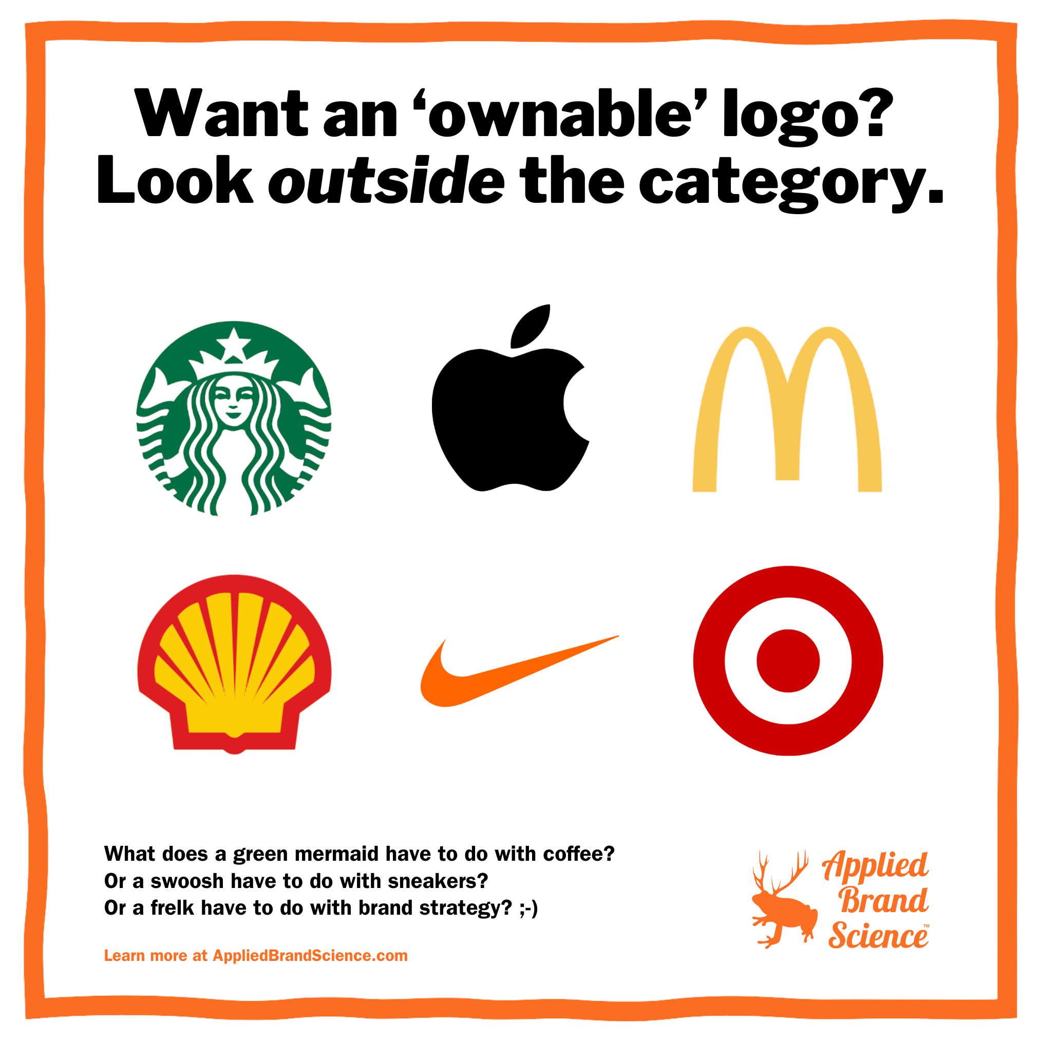
So instead of using a “relevant” symbol for your logo, pick something irrelevant. Something unique. Something nobody in their right mind would pick.
- Coffee brand? A mermaid / siren / princess thing. And make it green.
- Computers and cell phones? An apple. A black apple.
- Brand science? A frog with elk antlers.
They’re noticeable. They’re distinct. They’re memorable.
And they’re “ownable.” (Brrp—sorry, just threw up in my mouth a little bit.)
(There’s lots more science to the art of logos. Call us if you want to learn more.)