Are you dead-set on refreshing your brand?
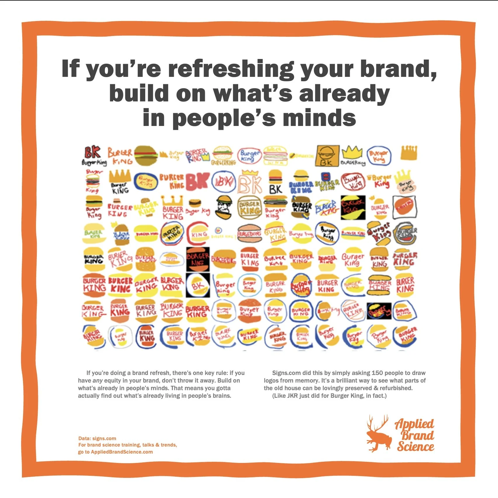
If you’re doing a brand refresh, there’s one key rule: if you have any equity in your brand, don’t throw it away.
Pleeeeeease.
Instead, build on what’s already in people’s minds.
That means you gotta actually find out what’s already living in people’s brains.
Signs.com did this by simply asking 150 people to draw logos from memory in their “Branded in Memory” project. They found out some interesting stuff.
F’rinstance, only 18% of people drew a good modern Burger King logo. 21% drew the previous logo (the one used from 1969-1999). And 21% drew a crown, which was a tiny feature from ‘57-’68.
Jones Knowles Ritchie and Burger King must’ve known something like this when they redid the BK logo recently: it beautifully builds on the ‘69 logo — which is still kicking around in lots of people’s minds.
(Of course, if you have no equity in your brand/logo/colors, the sky’s the limit!)
So some lessons:
+ Peek into people’s minds to see what parts of your brand live there.
+ Build on those parts. That’s brand equity.
+ Make it as easy as possible for people to remember you & recognize you.
Go read the whole thing over at signs.com/branded-in-memory. It’s awesomesauce.

